Best responsive web design libraries or tools
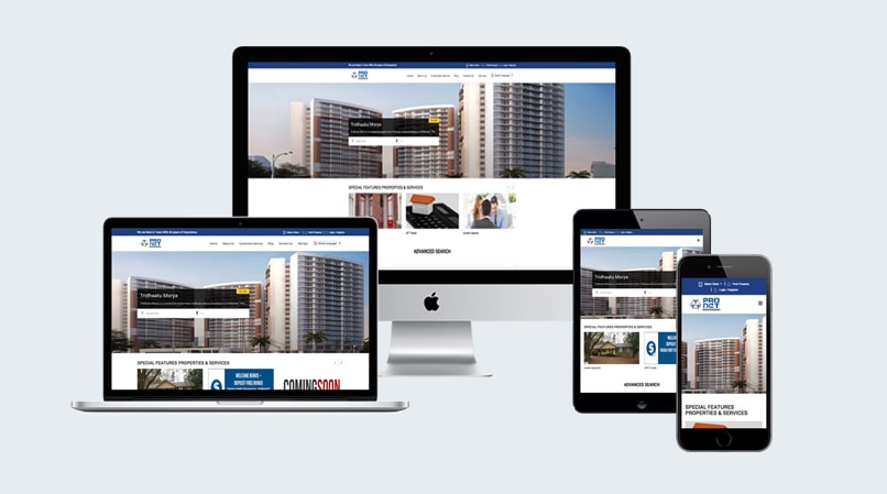
Responsive web design is a approach aimed at crafting site to provide a optimal viewing and interaction.easy reading and navigation with minimum re sizing,panning and scrolling for wide range of device.It is hard to overestimate the importance of responsive design because it guarantees that any website will look good in different screen resolutions.
I think everyone will agree with me that the first thing that every self-respecting designer. some libraries or resources helps to design a flexible architecture, which will automatically adapt to different conditions and, therefore, will be displayed properly on every screen resolution.
No matter how many new devices will enter our life in future, responsive websites will be always able to provide a suitable response.
1. Twitter Bootstrap
For developing responsive web pages in HTML, CSS and JavaScript, Bootstrap is the most popular framework among web designers and developers. IT make faster and easy to frond end development for programmers. It’s made for folks of all skill levels, devices of all shapes, and projects of all sizes.
2. Ink
Ink provide a responsive email framework that help you to create responsive HTML emails that works on any device and can be read anywhere.
3. Foundation
Foundation is another popular responsive front-end framework. With this modern HTML5 framework, you can approach web design either mobile first, or from big displays down to mobile sizes.
4. Skeleton
Skeleton is a simple and clean responsive CSS boilerplate for HTML5 websites and apps. It’s got just the things you need, and nothing more.
5. Simplegrid
Creating the code for your grid should be the least of your problems when building a site. That’s why SG keeps things simple and straightforward with as little markup and classes as possible. Even nesting grid slots doesn’t require extra classes.
6. HTML5 Boilerplate
HTML5 Boilerplate became one of the first, and subsequently, most popular open source front-end web development tools for getting HTML5 websites and web apps up and running in no time. It’s a compilation web development solutions that enable our sites to support modern web browsers.
7. Furatto
Furatto is lightweight and simple to use for front end programming and developing responsive web pages. Hidding things on small devices is important to improve user experience. Furatto provides class names to hide or show the elements you want for different screen sizes.
8. HTML KickStart
HTML KickStart packs quite a punch: UI components like stylish buttons and navigation bars, scalable icons (using Font Awesome), a responsive grid layout, a touch-enabled slideshow component and so on.
9. Lessframework
Less Framework is a CSS grid system for designing adaptive websites. It contains 4 layouts and 3 sets of typography presets, all based on a single grid.
10. Restivejs
Restive.JS is a JQuery Plugin that helps you quickly and easily add features to your Web Site to enable it respond and adapt to virtually every Web-enabled Device. Using a combination of Device Detection, Advanced Breakpoints Management, and Orientation Management.